Multi-themeshadcn/ui component library.
Each theme is built and tuned separately for real differentiation — not a one-click skin — while sharing a consistent component API.
Hand-tuned themes with a shared component core.
Explore every theme as its own system. Each one is tuned independently, but the component APIs stay consistent across the library.
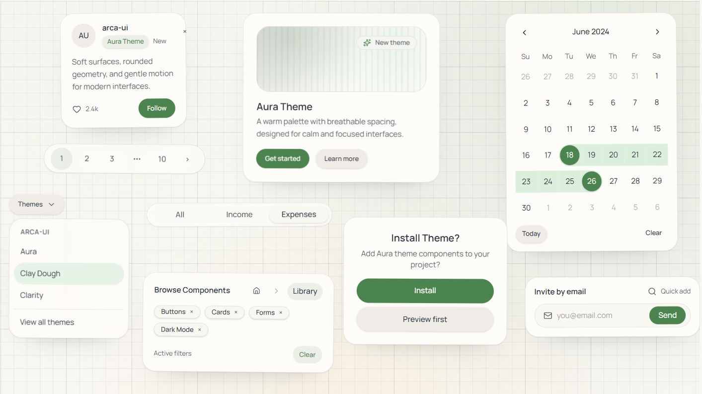
Aura
A soft, ethereal theme with glowing accents and smooth transitions.
Clarity
Clean and minimal design focused on readability and simplicity.
Clay Dough
Playful and organic with soft, rounded shapes and warm colors.
Hard Edge Stack
Neo-brutalist design with sharp edges and bold black shadows.
Paper Cut
Layered paper-like design with subtle shadows and depth.
Orbit Capsule
Futuristic space-inspired theme with pill shapes and gradients.
Soft Sculpt
Neumorphic design with soft shadows and embossed elements.
Tinted Trays
Colorful containers with tinted backgrounds and bold accents.
Zine Mark
Magazine-inspired editorial design with strong typography.